With all this hype about video ads… have you ever wondered what the perfect video ad would be?
Is it absolutely necessary to be featured in your own video? What if you’re camera shy or don’t have a professional studio? Can you get your message across with just text and animation? Maybe a nice tune to finish it all off?
Since you probably don’t have the time to test all of this out, we did it for you.
Together with Veeroll co-founder Gideon Shalwick, I set up two different Facebook Video Ads for his other business Splasheo.
We tested:
- A video “template” with animated text and images, and…
- A talking head video ad
….with the exact same targeting, budget and similar ad copy!
Can you guess which one did best?
Was it the talking head video?

Or the animated video?

Keep reading to find out!
This article is divided into two sections: how we set up the ads and of course… the results.
In the first section I will start with showing you both the ads, and which settings we used at the ad set and campaign level.
Setting Up The Ads
The Campaign
At the campaign level we chose Website Conversions as the objective, because our goal was to get people to sign up for a free report on the Splasheo website:

The Ad Sets
We used our ad sets to test out both of the ads with 3 different audiences each, 1 “cold” audience and 2 “warm” Custom Audiences.
(You can get the scoop on traffic temperature from Molly in this awesome guide.)
- Interest: for this ad set we targeted a cold audience with Interest based targeting, a group of people that had probably never heard of Splasheo before.
- Email List: for this ad set we uploaded one of Gideon’s email lists, a group of people that had signed up for one of his previous offers.
- Website Visitors: for this ad set we targeted people who’ve visited Splasheo.com, but hadn’t signed up yet.
As we were running 2 separate ads, we ended up with a total of 6 different Ad Sets and a daily budget of $10 per ad set.

Now you may be thinking…
“Why not just set up 3 ad sets and split test the ads at the ad level?”
Well, as you may have heard Molly Pittman mention before, Facebook doesn’t always equally distribute impressions across the ads when you set it up that way (unless you throw a ginormous budget at it).
So, we decided to test it at the ad set level to make sure it would be a legit test!
The Ads
Finally, we get to the actual ads!
We started this test thinking about how we could create a fair comparison. For the video templates we typically use a standard format of 5 or 6 lines of text. But, when you limit yourself to those same 5 lines in your own recording, it’s going to sound a little stiff!
Therefore we modified the talking head script just a tiny little bit, to make Gideon sound less like a robot (Robot Gideon is a whole another video type for us to try ;)).
Luckily he has 9 years of video marketing experience under his belt, so making it sound natural was a piece of cake for him.
Below you’ll see the talking head ad, including the exact script and a link to the video on Facebook:

“Hi there,Do you ever struggle with making your videos look nice and professional?If so, I think I might have something that you’d be interested in!My name is Gideon Shalwick, I’m the founder of Splasheo.com, and I know how frustrating and painful it can be to create nice and professional looking videos.Luckily we’ve come up with a new and easy method to follow, to help you create professional looking videos quickly and easily.I’ve created a free report that shows you exactly, step-by-step, how to do it.Around 80,000 people around the world have already tried it, so make sure you don’t miss out!Just go ahead and click on the ‘Learn More’ button inside this video, or inside this post, to be able to get instant access to this report.”
You can watch the entire ad, that ended up being 00:48 seconds long, right here.
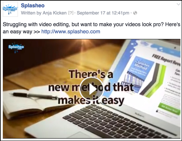
For the video template we used 5 lines of text and some images with a similar message, yet slightly more condensed.
Below you can see a screenshot of the ad, including the script, that we created using one of the Veeroll templates:

“Struggling to make your videos look pro?There’s a new method that makes it easyThis FREE report shows you exactly how79,894 people have already tried itClick link at the end for your free copy”
And, to watch the 00:33 second ad it in its entirety, click here.
For both of the ads we used the “Learn More” call-to-action button. And, because the template includes some fancy animations and music, we edited that in to the talking head ad as well.
All in all it seems like a fair comparison, right?
Because we hadn’t posted any of these videos on the Splasheo page before, we simply created new ads and uploaded the videos straight to the Power Editor.
(NOTE: Want the Ultimate Facebook Ad Template Library? Copy & paste these 7 proven Facebook ad campaigns to create low-cost, high-converting ads on demand. Get them here.)
What Were The Results?
When we started this test, I will admit that I was expecting the talking head ad to do slightly better. I expected this “personal touch” to win over purely animated text and images.
But… guess what? That was not the case at all!
In fact, after 11 days of running this test, we had a very clear winner: the template.
The Winner
Below you can see the data for both of the ads:
- the budget spent
- the amount of conversions
- the cost per lead
The talking head ad ended up costing us $2.80 per lead on average.
We gotta admit, that’s not too bad!

However, it got even better.
Because, the template converted at an even lower cost: $2.37 per lead!

As you can see we spent a similar budget on each ad set. Even though both the videos did well, the template clearly won!
The Audiences
We were also curious if we could see a clear difference in the cold and warm audiences. Would one of those groups be more inclined to respond to the template, or the talking head ad?
For example, would the people who already know Gideon respond better to the talking head video?
Well nope, not the case either!
As you can see in the screenshots, the template resulted in more conversions for all 3 audiences.
Interest Targeting

Email List

Website Visitors

BONUS DATA: Even though the point of this test was not to show how smart it is to do retargeting, it DOES show us that it is indeed! It’s interesting to see how much lower the cost per lead is (for both ads) for the “warmer” audiences.
You can tell that the people on Gideon’s email list were definitely the “warmest”! As they’ve already trusted him with their email address once before, they were much more likely to sign up for this lead magnet as well.
Ad Engagement
When it came to ad engagement we noticed that there was hardly any difference. Almost an equal amount of people shared, liked and commented on the template ad as on the talking head ad.
The talking head ad got a total of…
- 0 comments
- 9 post shares
- 37 likes and
- 7 page likes
…in these 11 days.

And, in that same time frame the template ad got…
- 1 comment
- 7 post shares
- 38 likes
- 7 page likes

Even though the engagement for both ads was similar, the template was more effective in getting people to take the ACTION we wanted them to take, which was to sign up for the free report.
Interesting!
What Have We Learned
So, both ads had a similar message, and one of them had much more personal touch to it.
Now you may be wondering…then WHY is it that the template performed better?
Well we’re not entirely sure! We would not be wise marketers if we would draw a major conclusion from just ONE (relatively small) test.
But, we do think that the effectiveness of this template is related to the fact that video ads have their sound turned off by default. Therefore, using animated text in your videos can be an incredibly powerful way to grab someone’s attention, while they’re scrolling their newsfeed.
Of course each business is different and you should always test and combine various types of ads, to find out what works best for YOU.
However (now that I’ve got this disclaimer out of the way…. !) this test does show that…
“I don’t want to be the face of my company,”“I don’t have a professional home studio,”“I’m camera shy!”
…is not an excuse not to run video ads.
Agree?
If you’re short on time or not that comfortable on video, you can still run some VERY effective video ads with great results.


No comments:
Post a Comment